Tuesday 14 December 2010

Double page spread

This is the new layout for my double page spread.
This one improves immeasurably on my first one as it looks on the whole a lot more like a double page spread in a magazine.
My first attempt had only two text boxes, one on each side of the page. This prevented me from achieving a professional style with the design of the page as it made it look more like a poster or the inside of a book. The columns are a much better layout style for the text ad improve the look considerably.

The large text break titles also help to break up the text and clearly inform readers where different sections of the article start and finish.
I also think that the 'Try These' column in the bottom right hand corner is a nice touch and is a feature that would not look out of place in any published magazine. It adds well to the general aesthetic of the pages and also gives the reader another piece of information adding to the value for money of the magazine.
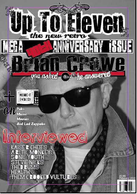
I have also added a block of color behind the title allowing the lettering to stand out much better and breaking the left hand page up showing that it is the title page. The fact that there is no text on the left hand page helps to show that this is the start of a small feature in this issue of the magazine that will last for a couple of pages as it almost acts as a front cover for that group of articles.
The quotation on the left of the page is also a new item and adds a small insight into the kind of things that the interview subject will be talking about in the article.

contents page

This is my new contents page.I have also changed the look of this after my first attempt. On my first contents page there was barely any information and it seemed as though there were only about six items in my entire magazine.

I have changed this now and added a lot more text to show the reader where to find each article in the magazine and what each thing is about.
I drew emphasis from Q magazine and NME for this contents page as these are two of the most popular music magazines and two of the best selling.
I have gone for a clean style with the contents page but also bringing in some of the eroded style elements from the front cover as these give a very rock and roll feel to the magazine and helps to maintain the retro styling on through the magazine's pages.

I think that my contents page is now a lot more packed and gives a much better opening second page to the magazine. The contents pages is the second thing that people turn to and needs to be clean and instructive but still interesting to the reader.


Today i have altered my front page considerably as i did not feel that it reflected the style of the magazine particularly well.
I also think that t did not look like a professional, contemporary music magazine that you would see on a shelf in a shop.

As you can see i have drastically altered the main styling of the magazine. I have also added a lot more detail and information onto the front cover.
The tag lines and information presented on the front cover of a magazine are essential to grab the readers attention as it tells them what else is inside the magazine. I think that my first attempt at the front cover did not have the sufficient power to capture an audiences attention before as it only gave a slight insight as to
what other features and articles my magazine contains.
The image below is of my old cover. You can see that on the new one at the the top of the post that i have added more tag lines and given a list of bands interviewed inside the magazine. I have also listed a feature held inside the magazine about a band named midnight embassy.
I have also taken the 40th Anniversary tag from the very top of the old cover and made it a central part in the middle of the new magazine. I have done this as i think that the fact that the magazine is a 4oth anniversary special should be promoted a lot more and would draw an audience to the magazine extremely effectively.

I have also removed the 'Insider tickets' tagline from the right hand side of the magazine. This did not add any thing to the magazine how it was simply looked out of place and like an accident. I have also made the fonts i used fit together a lot better. Before i had several different fonts as you can see and none of them really kept a uniform style of complimented each other. Now i have used a pretty much standard block capital style for all the lettering altering the fonts of different items slightly so as to allow them to stand out from the others.


Friday 30 April 2010

this is the front cover of my student magazine.
This is the contents page from my student magazine.
This is the front cover from my music magazine.
This is the main contents page from my music magazine.
This is the double page spread from my music magazine.

Friday 5 February 2010

double page spread

Today i have started work on my double page spread, i began by dividing the page into two columns in order to establish two separate pages and then worked around this format.
I then began to elaborate by adding a title and using a more interesting font and strokes to add emphasis i also added a drop shadow to my title.

Friday 29 January 2010

Contents

Today have done the contents page of my magazine. I have finished the basics of this page and now just need to add in the pictures in order to complete the page.
I have used several different wingding fonts in order to give this section of the magazine a retro, vintage, rock n roll feel.